Data
Data is from Eurostat. Since we have the joy of the Eurostat package, suffice to say this is dataset une_rt_m. Since the get_eurostat function gave me codes for things such as country and gender, the first step is to use a dictionary to decode. Subsequently, the country names are a bit sanitized and data is selected.library(eurostat)
library(ggplot2)
library(KernSmooth)
library(plyr)
library(dplyr)
library(scales) # to access breaks/formatting functions
mutate(.,geo=as.character(geo)) # character preferred for merge
r2 <- get_eurostat_dic('geo') %>%
rename(.,geo=V1) %>%
mutate(.,
# part of country name within braces removed
country=gsub('\\(.*$','',V2),
country=gsub(' $','',country),
country=ifelse(geo=='EA19',paste(country,'(19)'),country)) %>%
select(.,geo,country) %>%
right_join(.,r1) %>%
# keep only total, drop sexes
filter(.,sex=='T') %>%
# filter out old Euro area and keep only EU28 , EA19
filter(.,!grepl('EA..',geo)| geo=='EA19') %>%
filter(.,!(geo %in% c('EU15','EU25','EU27')) ) %>%
# SA is seasonably adjusted
filter(.,s_adj=='SA') %>%
mutate(.,country=factor(country)) %>%
select(.,-sex,-s_adj)
Plots
To make plots I want to have smoothed data. Ggplot will do this, but it is my preference to have the same smoothing for all curves, hence it is done before entering ggplot. There are a bit many countries, hence the number is reduced to 36, which are displayed in three plots of 3*4, for countries with low, middle and high maximum unemployment respectively. Two smoothers are applied, once for the smoothed data, the second for its first derivative. The derivative has forced more smooth, to avoid extreme fluctuation.
# add 3 categories for the 3 3*4 displays
r3 <- aggregate(r2$values,by=list(geo=r2$geo),FUN=max,na.rm=TRUE) %>%
mutate(.,class=cut(x,quantile(x,seq(0,3)/3),
include.lowest=TRUE,
labels=c('low','middle','high'))) %>%
select(.,-x) %>% # maxima not needed any more
right_join(.,r2)
#locpoly to make smooth same for all countries
Perc <- ddply(.data=r3,.variables=.(age,geo),
function(piece,...) {
piece <- piece[!is.na(piece$values),]
lp <- locpoly(x=as.numeric(piece$time),y=piece$values,
drv=0,bandwidth=90)
sdf <- data.frame(Date=as.Date(lp$x,origin='1970-01-01'),
sPerc=lp$y,
age=piece$age[1],
geo=piece$geo[1],
country=piece$country[1],
class=piece$class[1])}
,.inform=FALSE
)
# locpoly for deriviative too
dPerc <- ddply(.data=r3,.variables=.(age,geo),
function(piece,...) {
piece <- piece[!is.na(piece$values),]
lp <- locpoly(x=as.numeric(piece$time),y=piece$values,
drv=1,bandwidth=365/2)
sdf <- data.frame(Date=as.Date(lp$x,origin='1970-01-01'),
dPerc=lp$y,
age=piece$age[1],
geo=piece$geo[1],
country=piece$country[1],
class=piece$class[1])}
,.inform=FALSE
)
The plots are processed by subsection.
for (i in c('low','middle','high')) {
png(paste(i,'.png',sep=''))
g <- filter(Perc,class==i) %>%
ggplot(.,
aes(x=Date,y=sPerc,colour=age)) +
facet_wrap( ~ country, drop=TRUE) +
geom_line() +
theme(legend.position = "bottom")+
ylab('% Unemployment') + xlab('Year') +
scale_x_date(breaks = date_breaks("5 years"),
labels = date_format("%y"))
print(g)
dev.off()
}
for (i in c('low','middle','high')) {
png(paste('d',i,'.png',sep=''))
g <- filter(dPerc,class==i) %>%
ggplot(.,
aes(x=Date,y=dPerc,colour=age)) +
facet_wrap( ~ country, drop=TRUE) +
geom_line() +
theme(legend.position = "bottom")+
ylab('Change in % Unemployment') + xlab('Year')+
scale_x_date(breaks = date_breaks("5 years"),
labels = date_format("%y"))
print(g)
dev.off()
}
Results
In general, things are improving, which is good news, though there is still ways to go. As always, Eurostat has a nice document are certainly more knowledgeable than me on this topic.
Average unemployment


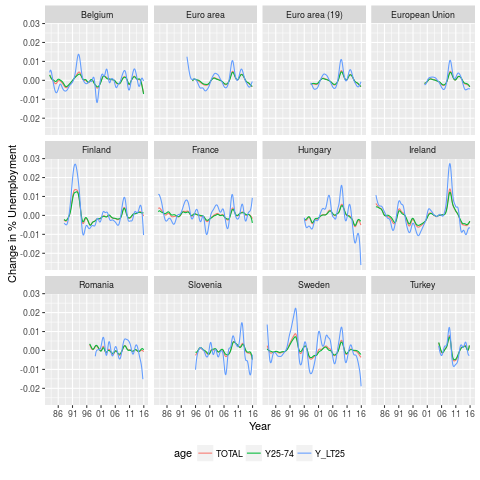
First derivative


good job!
ReplyDeleteplease can you tell me what is y25-74, y_lt25
thanks
I guess it's ages 25 to 74, and ages lower than (lt) 25.
ReplyDeleteTwo issues to get this running:
ReplyDelete> library(devtools)
> install_github("ropengov/eurostat")
The working eurostat package should be uploaded to CRAN in 2 to 3 weeks.
Second is a small errata in the second for loop (dPerc):
> ggplot(.,
aes(x=Date,y=dPerc,colour=age)) +
y=dPerc should be y=dperc
Thank you for sharing your knowledge :)
Hai, thanks for sharing this article. am finding this one among the best articles to know more about the R programming.
ReplyDeleteBTW, am facing below error while trying to fetch the eurostat data.
I could not find a way to followup with this issue with eurostat team.
am just wondering if you could help me out with this error.
> r1 <- get_eurostat('une_rt_m')%>% mutate(.,geo=as.character(geo))
trying URL 'http://ec.europa.eu/eurostat/estat-navtree-portlet-prod/BulkDownloadListing?sort=1&file=data%2Fune_rt_m.tsv.gz'
Content type 'application/octet-stream;charset=UTF-8' length 327606 bytes (319 KB)
downloaded 319 KB
Error in if (tcode != "_" && nchar(times[1]) > 7) { :
missing value where TRUE/FALSE needed
Appreciate your efforts in this regard.
Thanks.