Sunday, February 14, 2016

Confidence intervals for Proportions

Since I read documents with Clopper-Pearson a number of times the last weeks, I thought it a good idea to play around with confidence intervals for proportions a bit; to examine how intervals differ between various approaches. From a frequentist side Clopper-Pearson, which is described as the frequentist's gold standard and secondly the easy way normal approximation. From the Bayesian side, binomial with beta Beta prior. Obviously, the intervals have completely different interpretation in the frequentist and Bayesian framework, but that is a different discussion. There will be no data in this analysis, I am just making intervals based on possible results

Code

There are many ways to set this up. I wanted some plots. My first approach; given an observed proportion of 'correct', how does the total of trials change the intervals? The second approach; given that a certain number of trials is done, how do the intervals change as the number correct changes?

Since I want to repeat many of these calculations, I first made some supporting functions. This is because I am trying to write more clear code, where as much as possible code is not repeated but rather delegated to some sort of function. That may not result in the shortest or fastest code, but at this point neither is required.

Intervals

The first functions create the intervals from n (observed) and N (total). Clopper-Pearson is extracted from binom.test(). Normal approximation is based on an internet example. Beta-Binomial has three functions, one for the actual work, two to set up the desired priors and adapt the naming. A final function calls all these. 

clopper.pearson <- function(n,N,conf.level=0.95) {
  limits <- as.numeric(binom.test(n,N,conf.level=conf.level)$conf.int)
  names(limits) <- c('cp_low','cp_high')
  limits
}

binom.norm.app <- function(n,N,conf.level=0.95) {
  # based on http://www.r-tutor.com/elementary-statistics/interval-estimation/interval-estimate-population-proportion
  phat <- n/N
  shat <- sqrt(phat*(1-phat)/N)
  limit <- (1-conf.level)/2
  zlim <- qnorm( c(limit,1-limit))*shat
  limits <-  phat+zlim
  names(limits) <- c('na_low','na_high')
  limits  
}

beta.binomial <- function(n,N,conf.level=0.95,prior=c(1,1)){
  limit <- (1-conf.level)/2
  limits <- qbeta(c(limit,1-limit),n+prior[1],N-n+prior[2])
  names(limits) <- c('bb_low','bb_high')
  limits
}
beta.binomial11 <- function(n,N,conf.level=0.95) {
  limits <- beta.binomial(n,N,conf.level=conf.level,prior=c(1,1))
  names(limits) <- c('bb11_low','bb11_high')
  limits
}
beta.binomial.5.5 <- function(n,N,conf.level=0.95) {
  limits <- beta.binomial(n,N,conf.level=conf.level,prior=c(0.5,0.5))
  names(limits) <- c('bb.5_low','bb.5_high')
  limits
}
  
all.intervals <- function(n,N,conf.level=0.95) {
     c(n=n,N=N,conf.level=conf.level,
      clopper.pearson(n,N,conf.level=conf.level),
      binom.norm.app(n,N,conf.level=conf.level),
      beta.binomial11(n,N,conf.level=conf.level),
      beta.binomial.5.5(n,N,conf.level=conf.level))
}

Post processing

Just doing an sapply() on all.intervals() gives a matrix. It needs to be processed a bit to get a nice data.frame which ggplot likes. Hence a function in which it is transposed, reshaped and names of the intervals are split. Naming is adapted for display purposes.
postprocessing <- function(have1outN) {
  have1outN <- as.data.frame(t(have1outN))
  have1outN <- reshape(have1outN,
      varying=list(names(have1outN)[-1:-3]),
      idvar=c('n','N','conf.level'),
      timevar='statistic',
      times=names(have1outN)[-1:-3],
      v.names='limit',
      direction='long')
  
  have1outN$direction <- 
      sub('^.+_','',have1outN$statistic)
  have1outN$Method <- 
      sub('_.+$','',have1outN$statistic)
  have1outN$Method[have1outN$Method=='cp']<- 'Clopper Pearson'
  have1outN$Method[have1outN$Method=='na']<-'Normal Approximation'
  have1outN$Method[have1outN$Method=='bb.5']<- 'Beta Bionomial prior 0.5 0.5'
  have1outN$Method[have1outN$Method=='bb11']<- 'Beta Bionomial prior 1 1'
  have1outN
}

Results

Results for a proportion correct

The codes are variations on this example for 50% correct. As most of the work is done in the supporting functions, there is no need to repeat the code:
have1outN <- sapply(1:20,function(x) all.intervals(1*x,2*x))
have1outN <- postprocessing(have1outN)
ggplot(have1outN,aes(x=limit,y=N,col=Method,l=direction)) + 
 geom_path() +
 xlim(c(min(0,have1outN$limit),max(1,have1outN$limit))) +
 ggtitle('Interval at 1/2 correct') +
 theme(legend.position="bottom") +
 guides(col=guide_legend(ncol=2))


It seems that especially at lower N the Normal approximation is not advisable. Having an interval stick outside the range 0-1 is obviously a dead giveaway that something is not correct. But even if that does not happen, the lines are pretty far of the remainder of the methods. The difference between the two Beta Binomials is surprisingly small and only visible when very few observations are made. Clopper-Pearson seems to give slightly wider intervals than Beta Binomial.

Results for a fixed N

Again, the code is variations on a theme, with the work being done by the supporting functions.

Again the normal approximation is the odd out. It also seems to degenerate at n=0 and n=N. Other than that the choice of prior in the Beta Binomial is more expressed that the previous plots.

Tuesday, February 2, 2016

Unemployment in Europe

A couple of years I have made plots of unemployment and its change over the years. At first this was a bigger and complex piece of code. As things have progressed, the code can now become pretty concise. There are just plenty of packages to do the heavy lifting. So, this year I tried to make the code easy to read and reasonably documented.

Data

Data is from Eurostat. Since we have the joy of the Eurostat package, suffice to say this is dataset une_rt_m. Since the get_eurostat function gave me codes for things such as country and gender, the first step is to use a dictionary to decode. Subsequently, the country names are a bit sanitized and data is selected.
library(eurostat)
library(ggplot2)
library(KernSmooth)
library(plyr)
library(dplyr)

library(scales) # to access breaks/formatting functions

r1 <- get_eurostat('une_rt_m')%>%
    mutate(.,geo=as.character(geo)) # character preferred for merge
r2 <- get_eurostat_dic('geo') %>%
    rename(.,geo=V1) %>%
    mutate(.,
# part of country name within braces removed        
        country=gsub('\\(.*$','',V2),
        country=gsub(' $','',country),
        country=ifelse(geo=='EA19',paste(country,'(19)'),country)) %>%
    select(.,geo,country) %>%
    right_join(.,r1) %>%
# keep only total, drop sexes
    filter(.,sex=='T') %>%
# filter out old Euro area and keep only EU28 , EA19    
    filter(.,!grepl('EA..',geo)|  geo=='EA19') %>% 
    filter(.,!(geo %in% c('EU15','EU25','EU27')) ) %>%         
# SA is seasonably adjusted    
    filter(.,s_adj=='SA') %>% 
    mutate(.,country=factor(country)) %>%
    select(.,-sex,-s_adj)

Plots

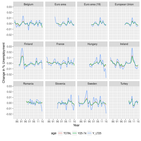
To make plots I want to have smoothed data. Ggplot will do this, but it is my preference to have the same smoothing for all curves, hence it is done before entering ggplot. There are a bit many countries, hence the number is reduced to 36, which are displayed in three plots of 3*4, for countries with low, middle and high maximum unemployment respectively. Two smoothers are applied, once for the smoothed data, the second for its first derivative. The derivative has forced more smooth, to avoid extreme fluctuation.

# add 3 categories for the 3 3*4 displays
r3 <- aggregate(r2$values,by=list(geo=r2$geo),FUN=max,na.rm=TRUE) %>%
    mutate(.,class=cut(x,quantile(x,seq(0,3)/3),
            include.lowest=TRUE,
            labels=c('low','middle','high'))) %>%
    select(.,-x) %>% # maxima not needed any more
    right_join(.,r2)

#locpoly to make smooth same for all countries
Perc <- ddply(.data=r3,.variables=.(age,geo), 
    function(piece,...) {
      piece <- piece[!is.na(piece$values),]
      lp <- locpoly(x=as.numeric(piece$time),y=piece$values,
          drv=0,bandwidth=90)
      sdf <- data.frame(Date=as.Date(lp$x,origin='1970-01-01'),
          sPerc=lp$y,
          age=piece$age[1],
          geo=piece$geo[1],
          country=piece$country[1],
          class=piece$class[1])}
    ,.inform=FALSE
)

# locpoly for deriviative too
dPerc <- ddply(.data=r3,.variables=.(age,geo), 
    function(piece,...) {
      piece <- piece[!is.na(piece$values),]
      lp <- locpoly(x=as.numeric(piece$time),y=piece$values,
          drv=1,bandwidth=365/2)
      sdf <- data.frame(Date=as.Date(lp$x,origin='1970-01-01'),
          dPerc=lp$y,          
          age=piece$age[1],
          geo=piece$geo[1],
          country=piece$country[1],
          class=piece$class[1])}
    ,.inform=FALSE
)
The plots are processed by subsection.
for (i in c('low','middle','high')) {
  png(paste(i,'.png',sep=''))
  g <- filter(Perc,class==i) %>%
      ggplot(.,
          aes(x=Date,y=sPerc,colour=age)) +
      facet_wrap( ~ country, drop=TRUE) +
      geom_line()  +
      theme(legend.position = "bottom")+
      ylab('% Unemployment') + xlab('Year') +
      scale_x_date(breaks = date_breaks("5 years"),
          labels = date_format("%y")) 
  print(g)
  dev.off()
}
for (i in c('low','middle','high')) {
  png(paste('d',i,'.png',sep=''))
  g <- filter(dPerc,class==i) %>%
      ggplot(.,
          aes(x=Date,y=dPerc,colour=age)) +
      facet_wrap( ~ country, drop=TRUE) +
      geom_line()  +
      theme(legend.position = "bottom")+
      ylab('Change in % Unemployment') + xlab('Year')+
      scale_x_date(breaks = date_breaks("5 years"),
          labels = date_format("%y"))
  print(g)
  dev.off()
}

Results

In general, things are improving, which is good news, though there is still ways to go. As always, Eurostat has a nice document are certainly more knowledgeable than me on this topic. 

Average unemployment

First derivative


Sunday, January 17, 2016

A simple ANOVA

I was browsing Davies Design and Analysis of Industrial Experiments (second edition, 1967). Published by for ICI in times when industry did that kind of thing. It is quite an applied book. On page 107 there is an example where the variance of a process is estimated.

Data

Data is from nine batches from which three samples were selected (A, B and C) and each a duplicate measurement. I am not sure about copyright of these data, so I will not reprint the data here. The problem is to determine the measurement ans sampling error in a chemical process.
ggplot(r4,aes(x=Sample,y=x))+
    geom_point()+
    facet_wrap(~  batch )


Analysis

At the time of writing the book, the only approach was to do a classical ANOVA and calculate the estimates from there.
aov(x~ batch + batch:Sample,data=r4) %>%
  anova
Analysis of Variance Table

Response: x
             Df Sum Sq Mean Sq  F value  Pr(>F)    
batch         8 792.88  99.110 132.6710 < 2e-16 ***
batch:Sample 18  25.30   1.406   1.8818 0.06675 .  
Residuals    27  20.17   0.747                     
---
Signif. codes:  0 ‘***’ 0.001 ‘**’ 0.01 ‘*’ 0.05 ‘.’ 0.1 ‘ ’ 1
In this case the residual variation is 0.75. The batch:Sample variation estimates is, due to the design, twice the sapling variation plus residual variation. Hence it is estimated as 0.33. How lucky we are to have tools (lme4) which can do this estimate directly. In this case, as it was a well designed experiment, these estimates are the same as from the ANOVA. 
l1 <- lmer(x ~1+ (1 | batch) + (1|batch:Sample) ,data=r4 )

summary(l1)
Linear mixed model fit by REML ['lmerMod']
Formula: x ~ 1 + (1 | batch) + (1 | batch:Sample)
   Data: r4

REML criterion at convergence: 189.4

Scaled residuals: 
     Min       1Q   Median       3Q      Max 
-1.64833 -0.50283 -0.06649  0.55039  1.57801 

Random effects:
 Groups       Name        Variance Std.Dev.
 batch:Sample (Intercept)  0.3294  0.5739  
 batch        (Intercept) 16.2841  4.0354  
 Residual                  0.7470  0.8643  
Number of obs: 54, groups: batch:Sample, 27; batch, 9

Fixed effects:
            Estimate Std. Error t value

(Intercept)   47.148      1.355    34.8
A next step is confidence intervals around the estimates. Davies uses limits from a Chi-squared distribution for the residual variation, leading to a 90% interval 0.505  to 1.25. In contrast lme4 has two estimators, profile (computing a likelihood profile and finding the appropriate cutoffs based on the likelihood ratio test;) and bootstrap (perform parametric bootstrapping with confidence intervals computed from the bootstrap distribution according to boot.type). Each of these takes one or few second on my laptop, not feasible for the pre computer age. The estimates are different, to my surprise more narrow:
Computing profile confidence intervals ...
                   5 %       95 %
.sig01       0.0000000  0.9623748
.sig02       2.6742109  5.9597328
.sigma       0.7017849  1.1007261
(Intercept) 44.8789739 49.4173227

Computing bootstrap confidence intervals ...
                                  5 %       95 %
sd_(Intercept)|batch:Sample  0.000000  0.8880414
sd_(Intercept)|batch         2.203608  5.7998348
sigma                        0.664149  1.0430984

(Intercept)                 45.140652 49.4931109
Davies continues to estimate the ratio to residual for sampling variation, which was the best available for that time. This I won't repeat.

Sunday, January 3, 2016

A plot of 'Who works at home'

I ran across this post containing displays on who works from home. I must say it looks great and is interactive but it did not help me understand the data. So I created this post to display the same data with a boring plot which might help me. For those really interested in this topic, census.gov created a .pdf which contains a full report with much more information than here.

Data

Data is from census.gov. I have taken the first spreadsheet. It is one of those spreadsheets with counts and percentages and empty lines to display categories. Very nice to check some numbers, horrible to process. So, a bit of code to extract the numbers.
library(gdata)
r1 <- read.xls('2010_Table_1.xls',stringsAsFactors=FALSE)
# throw out percentages
r2 <- r1[,r1[4,]!='Percent']
# put all column names in one row
r2$X.6[2] <- r2$X.6[3]
r2$X.8[2] <- r2$X.8[3]
# select part with data
r3 <- r2[2:61,c(1,3,5,6)]
names(r3)[1] <- r3[1,1]
r4 <-r3[c(-1:-3),]
#eliminate one row with mean income. 
r4 <- r4[-grep('$',r4[,2],fixed=TRUE),]
#reshape in long form
r5 <- reshape(r4,
    varying=list(names(r4)[-1]),
    v.names='count',
    direction='long',
    idvar='Characteristic',
    timevar='class',
    times=r3[1,2:4])
row.names(r5) <- 1:nrow(r5)
# remove ',' from numbers and make numerical values. 
# units are in 1000, so update that too
r5$count <- as.numeric(gsub(',','',r5$count))*1000
# clean up numbers used for footnotes
r5$class <- gsub('(1|2|3)','',r5$class)
#some upfront '.' removed.
r5$Characteristic <- gsub('^\\.+','',r5$Characteristic)
# create a factor
r5$Characteristic <- factor(r5$Characteristic,
   levels=rev(r5$Characteristic[r5$class=='Home Workers']))
# and create a higher level factor
r5$Mchar=r5$Characteristic
for (i in 1:nrow(r5)) r5$Mchar[i] <- 
   if(is.na(r5$count[i]) | r5$Mchar[i]=='Total') r5$Mchar[i] 
   else r5$Mchar[i-1]

Plot

The plot is made using old style graphics. I could not get either ggplot2 or lattice to provide the plot I wanted.
# prepare for axis labels
index <- subset(r5,r5$class=='Home Workers',c(Characteristic,Mchar))
index$y=56:1
index2 <- index[index$Characteristic!=index$Mchar | index$Characteristic=='Total',]
index3 <- index[index$Characteristic==index$Mchar & index$Characteristic!='Total',]

r6 <- merge(r5,index)
r6$class <- factor(r6$class)
par(mar=c(5,18,4,2)+.1,cex=.7)
plot(x=r6$count,y=r6$y,axes=FALSE,
    xlab='Count',
    ylab='',
    col=c('red','green','blue')[r6$class],
    frame.plot=TRUE,
 #   log='x',
    ylim=c(2,58))
axis(1)
axis(2,at=index2$y,labels=index2$Characteristic,las=1)
text(y=index3$y-.1,x=30000,labels=index3$Characteristic,adj=0)
legend('topleft',legend=levels(r6$class),
    ncol=3,col=c('red','green','blue'),
    border=NULL,pch=1,
    yjust=0)

Why I did not use ggplot2?

The ideal solution for ggplot2 might look something like this:
r7 <- r5[!is.na(r5$count),]
r7$Mchar <- factor(r7$Mchar,levels=unique(r7$Mchar))
ggplot(data=r7,
        aes(x=Characteristic,y=count,col=class)) +
    geom_point()+
    coord_flip()+
    xlab('')+ylab('')+
    ylim(0,max(r5$count))+
    facet_wrap(~Mchar,scales='free_x',ncol=2)+
    theme(legend.position="bottom")
However, this throws an error:
Error in facet_render.wrap(plot$facet, panel, plot$coordinates, theme,  : 
  ggplot2 does not currently support free scales with a non-cartesian coord or coord_flip.
I also tried the system described here: http://wresch.github.io/2014/05/22/aligning-ggplot2-graphs.html, but I think width has changed in content, could not get that to be satisfactory.

library(gtable)
library(gridExtra)

tt <- as.data.frame(table(r7$Mchar))
tt$Var1
tt$Freq[12] <- tt$Freq[12] +15

la <- lapply(tt$Var1,function(x) {
      r8 <- r5[r5$Mchar==as.character(x) ,]
      r8 <- r8[ !is.na(r8$count),]
      ggplot(data=r8,
              aes(x=Characteristic,y=count,col=class)) +
          geom_point()+
          coord_flip()+
          xlab('')+ylab('')+
          ylim(0,max(r5$count))
    })

# http://wresch.github.io/2014/05/22/aligning-ggplot2-graphs.html
lax <- lapply(la,function(x) x$widths[2:3])
maxwidths <- do.call(grid::unit.pmax,lax)
for(i in 1:12) la[[i]]$widths <- as.list(maxwidths)


la[[12]] <- la[[12]] + 
    theme(legend.position="bottom",  
        plot.margin = unit(c(0.01, 0.1, 0.02, 0.1), "null"))
for (i in 1:11) la[[i]] <- la[[i]] +
      theme(legend.position="none",
          axis.text.x = element_blank(),
          axis.title.x = element_blank(), 
          axis.ticks.x = element_blank(),
         plot.margin = unit(c(0.01, 0.1, 0.02, 0.1), "null"))

lag <- lapply(la,ggplotGrob)


g <- gtable_matrix(name = "demo",
    grobs = matrix(lag, nrow = 12), 
    widths = unit(9, "null"),
    heights = unit(tt$Freq, "null"))

grid.newpage()
grid.draw(g)

Saturday, December 12, 2015

Vacancies in the Netherlands

Over the last couple of years, each weekend I have registering how many vacancies websites claim to have. This post shows some of the observations one may draw from the plots.

Data

Data is from general and more specialized websites. The first observations started in 2010. Since that time there were a number of changes. In general, the most useful sites are uitzendbureau.nl, nuwerk.nl nationalevacaturebank.nl, indeed.nl and jobbird.nl. These all cover the whole market.
Uitzendbureau (employment agency) will cater mostly for the short term solutions. As an employer, wants an employee quickly, without much hassle, which can let go just as easy, an uitzendbureau is the port of call. The website covers many of these agencies, from what I have seen, I can confirm the bigger agencies. This makes the number of vacancies they have a marker from the general work market. The other three cover more the jobs at employers themselves. I seem to remember that nationalevacaturebank (national vacancies bank) did a lot of advertisement at the time. Nuwerk.nl is a subsite of nu.nl, a popular news site in the Netherlands. The others I added later to the collection.
In addition, there is VK banen, Intermediair and Stepstone. VK banen (Volkskrant) and Intermediair are the traditional sites for higher educated employees. Back in the time when internet was not a factor of importance, Intermediair came for free for high educated people starting just before graduation and ending at age 40 or 45. Thus traditionally it was one of the best places for vacancies. Volkskrant had somewhat lesser amount of vacancies, and many in education. At some point within the data they merged their vacancy activity. Stepstone is an international entity, which tries to get hold in the Dutch market.
Finally, BCFJobs is a website which caters Bio (life sciences), Chemistry and Food jobs. It does jobs from medium level upwards. It got into this list, because this covers my personal background.

Data import

Over the years I have used several (spreadsheet) programs to store the data. Currently it sits in Libreoffice, thus I will extract the data from an ODS file. read.ods resulted in a list (for each page in the spreadsheet) with an entry with text columns for each column in the page, I did not notice any option to directly employ the column names which were in row 1. Hence there is a bit of processing to obtain a data.frame.

Plots

General observations 

In the first figure there are uitzendbureaus, nuwerk and nationalevacaturebank. The line for nuwerk is terminated. At that point they switched to vacancies supplied by monsterboard. The numbers were totally different. and I stopped registering them.
Uitzendbureaus has quite fluctuating numbers. Especially in 2014, but to a lesser extend in other years, there is a spike just before summer holidays. Much of the work which needs to be done when people go on vacation is supplied via uitzendbureaus. A valley at the end of each year is caused by Christmas vacation. Many business close between Christmas and new year, somewhat depending on the actual weekdays on which they fall. As a result there is a dip in both uitzendbureau and nationalevacaturebank.nl. A final observation, which I find it difficult to explain is that the beginning of just many year shows some optimism. The number of vacancies increases. Then, after the summer vacation, things are more pessimistic. In the crisis years the second half of the year gave an actual decrease, post crisis it is a flat line. One possible explanation may be in the end of the school year just before summer. This means summer and autumn there may be a fresh batch out of school. Most of these may be entering their names at the uitzendbureau, one is required to search for a job, and this is one of the ways to go about that. By the end of the year these will all been supplied. But I could think of other reasons too (e.g. head count low at end of year, optimism/pessimism due to seasons).
Regarding the crisis, starting mid 2011 and continuing till end of 2012 there are less and less vacancies. 2013 is the year things stabilized, while in 2014 things started to get better. In terms of vacancies, we are getting to the level of the beginning of the series, before the crisis hit hard.
Nuwerk was actually able to weather the crisis reasonably well. However, subsequently they did lose a bit of market and the associated uptake in vacancies in 2014 was not captured. I imagine this is part of the reason they started using monsterboard.

Extending the web sites used

In this extended plot there a few extra sources. They are added for completeness sake. In addition, since the number of vacancies covers a larger scale, it is plotted on logarithmic scale. Werk is the government website. On this website one is required to register to which vacancies one has applied. Insufficient activity on the job acquisition will result in cuts in benefits. It also has vacancies. Unfortunately it is not a very good website and quite often in the weekend it is down for maintenance. I gave up on retrying later in the weekend, fortunately I was never in the situation of having to use this website.
Jobbird did quite some advertising at some point. However, there are some odd spikes. I am not sure what that is, but this is for me a reason to doubt if their number of vacancies is a good indicator of what is happening on the jobs market.
Indeed has a number for the new vacancies. This is therefor even more fluctuating. Every school vacation has a bigger or smaller dip. It is also one of the last websites which I added. Especially the large fluctuation was a big reason not to plot these data in the first figure.

Higher education

VK (Volkskrant) was traditionally the website where school teachers were recruited. As a consequence, somewhere end of April, beginning of May, a large number of vacancies appeared for the next school year. These are the peaks visible in the three years for which VK has data. A similar but much less pronounced peak is visible in 2013 and 2014. In the section above, I stated that 2013 was the year things stabilized. This is not true in this plot. Intermediair showed a decrease in 2013. Stepstone was able to gain some market, which they subsequently lost in 2014. Then 2014 was the year things stabilized and 2015 saw increases in jobs. What is happening end of 2015 is something new. Intermediair made a big jump in one week (2125 to 2645 from 12 to 19 September), stepstone followed a few weeks later with some jumps. This really feels like a change in the market.
In contrast, BCFJobs did fairly well through the crisis. However, during and after the summer vacation it did have a loss in vacancies. It is almost as if vacancies have been pulled from BCFJobs and placed into Intermediair and stepstone. As explained above, Intermediair is like the best known place for higher educated people to start their job search, likewise it may be the best place for employers to go to when it gets less easy to find employees. As the more and more people get employed again, this may be forcing the change. But that is speculation.

Conclusion

The number of jobs is fluctuating, depending on vacations, season and progress through the crisis. Regarding the crisis, 2013 was the year things stabilized and 2014 saw an increase in vacancies. For higher educated personnel, this change happened about a year later.

Code

library(readODS)
library(ggplot2)
library(dplyr)
r1 <- read.ods('banen.aantal.clean.ods')
mynames <- sapply(1:11,function(i) r1[[1]][1,i])
mycols <- lapply(1:11,function(i) {
      if (i==1) as.Date(r1[[1]][-1,1],format='%b %e, %Y')
      else as.numeric(r1[[1]][-1,i])})
r2 <- as.data.frame(mycols)
mynames
names(r2) <- mynames
r3 <- mutate(r2,
    Intermediair_VK=ifelse(!is.na(VK),NA,Intermediair),
    Intermediair=ifelse(is.na(VK),NA,Intermediair))

l1 <- reshape(r3,
    idvar='date',
    direction='long',
    varying=list(names(r3)[-1]),
    timevar='source',
    v.names='count',
    times=names(r3)[-1])

l1 %>% 
    filter(.,source %in% c('nationalevacaturebank.nl','uitzendbureaus',
            'nuwerk')) %>%
    ggplot(.,aes(y=count,x=Date,col=source)) +
    geom_line()+
    ylim(0,NA)+
    theme(legend.position="bottom")

l1 %>% 
    filter(.,source %in% c('nationalevacaturebank.nl','uitzendbureaus',
            'indeed','werk','jobbird','nuwerk'),
        Date>as.Date('2012-01-01')) %>%
    ggplot(.,aes(y=count,x=Date,col=source)) +
    geom_line()+
    scale_y_log10()+
    theme(legend.position="bottom")+
    labs(y='Count (log scale)')

l1 %>% 
    filter(.,source %in% c('VK','Intermediair','stepstone',
       'Intermediair_VK','BCFJobs')) %>%
    ggplot(.,aes(y=count,x=Date,col=source)) +
    geom_line()+
    ylim(0,NA)+
    theme(legend.position="bottom")