Sunday, February 14, 2016

Confidence intervals for Proportions

Since I read documents with Clopper-Pearson a number of times the last weeks, I thought it a good idea to play around with confidence intervals for proportions a bit; to examine how intervals differ between various approaches. From a frequentist side Clopper-Pearson, which is described as the frequentist's gold standard and secondly the easy way normal approximation. From the Bayesian side, binomial with beta Beta prior. Obviously, the intervals have completely different interpretation in the frequentist and Bayesian framework, but that is a different discussion. There will be no data in this analysis, I am just making intervals based on possible results

Code

There are many ways to set this up. I wanted some plots. My first approach; given an observed proportion of 'correct', how does the total of trials change the intervals? The second approach; given that a certain number of trials is done, how do the intervals change as the number correct changes?

Since I want to repeat many of these calculations, I first made some supporting functions. This is because I am trying to write more clear code, where as much as possible code is not repeated but rather delegated to some sort of function. That may not result in the shortest or fastest code, but at this point neither is required.

Intervals

The first functions create the intervals from n (observed) and N (total). Clopper-Pearson is extracted from binom.test(). Normal approximation is based on an internet example. Beta-Binomial has three functions, one for the actual work, two to set up the desired priors and adapt the naming. A final function calls all these. 

clopper.pearson <- function(n,N,conf.level=0.95) {
  limits <- as.numeric(binom.test(n,N,conf.level=conf.level)$conf.int)
  names(limits) <- c('cp_low','cp_high')
  limits
}

binom.norm.app <- function(n,N,conf.level=0.95) {
  # based on http://www.r-tutor.com/elementary-statistics/interval-estimation/interval-estimate-population-proportion
  phat <- n/N
  shat <- sqrt(phat*(1-phat)/N)
  limit <- (1-conf.level)/2
  zlim <- qnorm( c(limit,1-limit))*shat
  limits <-  phat+zlim
  names(limits) <- c('na_low','na_high')
  limits  
}

beta.binomial <- function(n,N,conf.level=0.95,prior=c(1,1)){
  limit <- (1-conf.level)/2
  limits <- qbeta(c(limit,1-limit),n+prior[1],N-n+prior[2])
  names(limits) <- c('bb_low','bb_high')
  limits
}
beta.binomial11 <- function(n,N,conf.level=0.95) {
  limits <- beta.binomial(n,N,conf.level=conf.level,prior=c(1,1))
  names(limits) <- c('bb11_low','bb11_high')
  limits
}
beta.binomial.5.5 <- function(n,N,conf.level=0.95) {
  limits <- beta.binomial(n,N,conf.level=conf.level,prior=c(0.5,0.5))
  names(limits) <- c('bb.5_low','bb.5_high')
  limits
}
  
all.intervals <- function(n,N,conf.level=0.95) {
     c(n=n,N=N,conf.level=conf.level,
      clopper.pearson(n,N,conf.level=conf.level),
      binom.norm.app(n,N,conf.level=conf.level),
      beta.binomial11(n,N,conf.level=conf.level),
      beta.binomial.5.5(n,N,conf.level=conf.level))
}

Post processing

Just doing an sapply() on all.intervals() gives a matrix. It needs to be processed a bit to get a nice data.frame which ggplot likes. Hence a function in which it is transposed, reshaped and names of the intervals are split. Naming is adapted for display purposes.
postprocessing <- function(have1outN) {
  have1outN <- as.data.frame(t(have1outN))
  have1outN <- reshape(have1outN,
      varying=list(names(have1outN)[-1:-3]),
      idvar=c('n','N','conf.level'),
      timevar='statistic',
      times=names(have1outN)[-1:-3],
      v.names='limit',
      direction='long')
  
  have1outN$direction <- 
      sub('^.+_','',have1outN$statistic)
  have1outN$Method <- 
      sub('_.+$','',have1outN$statistic)
  have1outN$Method[have1outN$Method=='cp']<- 'Clopper Pearson'
  have1outN$Method[have1outN$Method=='na']<-'Normal Approximation'
  have1outN$Method[have1outN$Method=='bb.5']<- 'Beta Bionomial prior 0.5 0.5'
  have1outN$Method[have1outN$Method=='bb11']<- 'Beta Bionomial prior 1 1'
  have1outN
}

Results

Results for a proportion correct

The codes are variations on this example for 50% correct. As most of the work is done in the supporting functions, there is no need to repeat the code:
have1outN <- sapply(1:20,function(x) all.intervals(1*x,2*x))
have1outN <- postprocessing(have1outN)
ggplot(have1outN,aes(x=limit,y=N,col=Method,l=direction)) + 
 geom_path() +
 xlim(c(min(0,have1outN$limit),max(1,have1outN$limit))) +
 ggtitle('Interval at 1/2 correct') +
 theme(legend.position="bottom") +
 guides(col=guide_legend(ncol=2))


It seems that especially at lower N the Normal approximation is not advisable. Having an interval stick outside the range 0-1 is obviously a dead giveaway that something is not correct. But even if that does not happen, the lines are pretty far of the remainder of the methods. The difference between the two Beta Binomials is surprisingly small and only visible when very few observations are made. Clopper-Pearson seems to give slightly wider intervals than Beta Binomial.

Results for a fixed N

Again, the code is variations on a theme, with the work being done by the supporting functions.

Again the normal approximation is the odd out. It also seems to degenerate at n=0 and n=N. Other than that the choice of prior in the Beta Binomial is more expressed that the previous plots.

Tuesday, February 2, 2016

Unemployment in Europe

A couple of years I have made plots of unemployment and its change over the years. At first this was a bigger and complex piece of code. As things have progressed, the code can now become pretty concise. There are just plenty of packages to do the heavy lifting. So, this year I tried to make the code easy to read and reasonably documented.

Data

Data is from Eurostat. Since we have the joy of the Eurostat package, suffice to say this is dataset une_rt_m. Since the get_eurostat function gave me codes for things such as country and gender, the first step is to use a dictionary to decode. Subsequently, the country names are a bit sanitized and data is selected.
library(eurostat)
library(ggplot2)
library(KernSmooth)
library(plyr)
library(dplyr)

library(scales) # to access breaks/formatting functions

r1 <- get_eurostat('une_rt_m')%>%
    mutate(.,geo=as.character(geo)) # character preferred for merge
r2 <- get_eurostat_dic('geo') %>%
    rename(.,geo=V1) %>%
    mutate(.,
# part of country name within braces removed        
        country=gsub('\\(.*$','',V2),
        country=gsub(' $','',country),
        country=ifelse(geo=='EA19',paste(country,'(19)'),country)) %>%
    select(.,geo,country) %>%
    right_join(.,r1) %>%
# keep only total, drop sexes
    filter(.,sex=='T') %>%
# filter out old Euro area and keep only EU28 , EA19    
    filter(.,!grepl('EA..',geo)|  geo=='EA19') %>% 
    filter(.,!(geo %in% c('EU15','EU25','EU27')) ) %>%         
# SA is seasonably adjusted    
    filter(.,s_adj=='SA') %>% 
    mutate(.,country=factor(country)) %>%
    select(.,-sex,-s_adj)

Plots

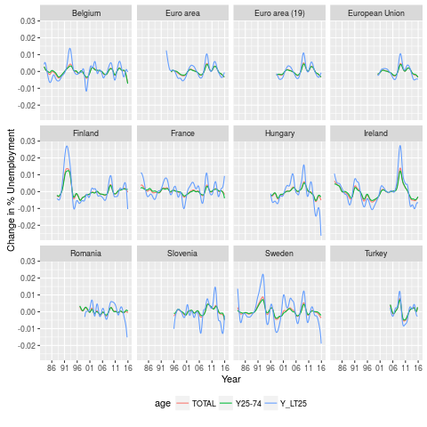
To make plots I want to have smoothed data. Ggplot will do this, but it is my preference to have the same smoothing for all curves, hence it is done before entering ggplot. There are a bit many countries, hence the number is reduced to 36, which are displayed in three plots of 3*4, for countries with low, middle and high maximum unemployment respectively. Two smoothers are applied, once for the smoothed data, the second for its first derivative. The derivative has forced more smooth, to avoid extreme fluctuation.

# add 3 categories for the 3 3*4 displays
r3 <- aggregate(r2$values,by=list(geo=r2$geo),FUN=max,na.rm=TRUE) %>%
    mutate(.,class=cut(x,quantile(x,seq(0,3)/3),
            include.lowest=TRUE,
            labels=c('low','middle','high'))) %>%
    select(.,-x) %>% # maxima not needed any more
    right_join(.,r2)

#locpoly to make smooth same for all countries
Perc <- ddply(.data=r3,.variables=.(age,geo), 
    function(piece,...) {
      piece <- piece[!is.na(piece$values),]
      lp <- locpoly(x=as.numeric(piece$time),y=piece$values,
          drv=0,bandwidth=90)
      sdf <- data.frame(Date=as.Date(lp$x,origin='1970-01-01'),
          sPerc=lp$y,
          age=piece$age[1],
          geo=piece$geo[1],
          country=piece$country[1],
          class=piece$class[1])}
    ,.inform=FALSE
)

# locpoly for deriviative too
dPerc <- ddply(.data=r3,.variables=.(age,geo), 
    function(piece,...) {
      piece <- piece[!is.na(piece$values),]
      lp <- locpoly(x=as.numeric(piece$time),y=piece$values,
          drv=1,bandwidth=365/2)
      sdf <- data.frame(Date=as.Date(lp$x,origin='1970-01-01'),
          dPerc=lp$y,          
          age=piece$age[1],
          geo=piece$geo[1],
          country=piece$country[1],
          class=piece$class[1])}
    ,.inform=FALSE
)
The plots are processed by subsection.
for (i in c('low','middle','high')) {
  png(paste(i,'.png',sep=''))
  g <- filter(Perc,class==i) %>%
      ggplot(.,
          aes(x=Date,y=sPerc,colour=age)) +
      facet_wrap( ~ country, drop=TRUE) +
      geom_line()  +
      theme(legend.position = "bottom")+
      ylab('% Unemployment') + xlab('Year') +
      scale_x_date(breaks = date_breaks("5 years"),
          labels = date_format("%y")) 
  print(g)
  dev.off()
}
for (i in c('low','middle','high')) {
  png(paste('d',i,'.png',sep=''))
  g <- filter(dPerc,class==i) %>%
      ggplot(.,
          aes(x=Date,y=dPerc,colour=age)) +
      facet_wrap( ~ country, drop=TRUE) +
      geom_line()  +
      theme(legend.position = "bottom")+
      ylab('Change in % Unemployment') + xlab('Year')+
      scale_x_date(breaks = date_breaks("5 years"),
          labels = date_format("%y"))
  print(g)
  dev.off()
}

Results

In general, things are improving, which is good news, though there is still ways to go. As always, Eurostat has a nice document are certainly more knowledgeable than me on this topic. 

Average unemployment

First derivative